A screenshot of the Office of Higher Education Minnesota homepage, at desktop size.
A screenshot of the Office of Higher Education Minnesota homepage, at mobile size.

An expanded view of the OHE megamenu.

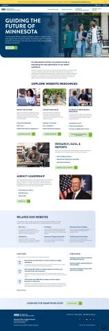
A landing page for OHE, at desktop size.
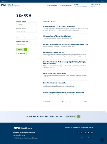
The OHE search page, at desktop size.

The OHE search page at mobile size.
The Minnesota Office of Higher Education's redesign had several focuses: clean and clear information in a slick, easy-to-browse interface. Our designer's interpretation hit all of the marks, with accessibility-friendly colors and typefaces, rounded corners and soft gradients giving the content some pop, and light touches of color splashes to make content stand out. What resulted is indeed a slick and easy-to-browse website, that holds up to my strictest accessibility and responsivity standards.